

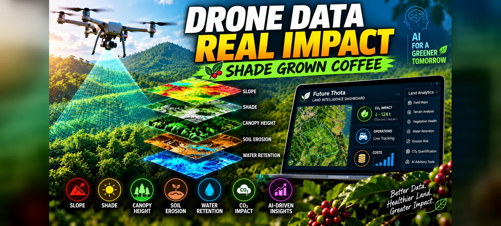
An accurate measure of what’s actually on the ground is the layer everything else has to sit on top of. Dashboards, cost tracking, AI-driven advisories — skip the ground truth, and every “smart” recommendation downstream is a guess wearing a nice interface. That’s the whole argument for a drone survey, and it’s worth taking seriously before getting to what the survey actually produces.
One accurate flight, done properly, becomes a living record of the land: what grows where, how the ground behaves, and the base layer for every decision and tool built on top of it.
From flat imagery to an interactive map
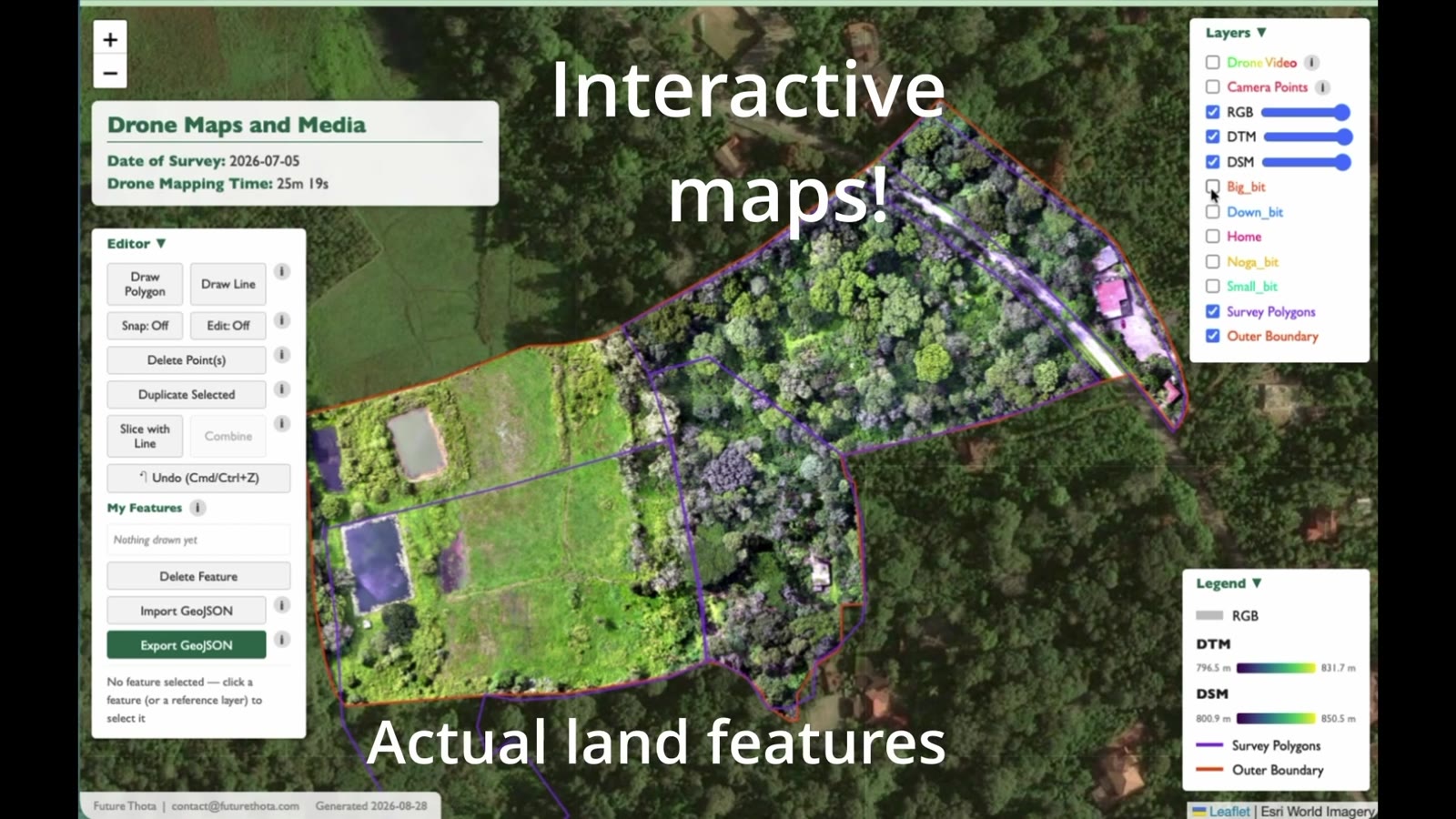 Every layer here — RGB imagery, terrain model, surface model, survey polygons — comes from the same flight.
The moment raw imagery lands, it stops being a picture and becomes a dataset you can query. Toggle RGB on and off against the digital terrain model (DTM) or digital surface model (DSM), draw new polygons, slice a boundary, export GeoJSON straight out of the browser — no desktop GIS software, no waiting on a consultant to send a static PDF back. This is the drone mapping and GIS layer that every other output below is built from.
A flat map shows where. A model shows how the land behaves
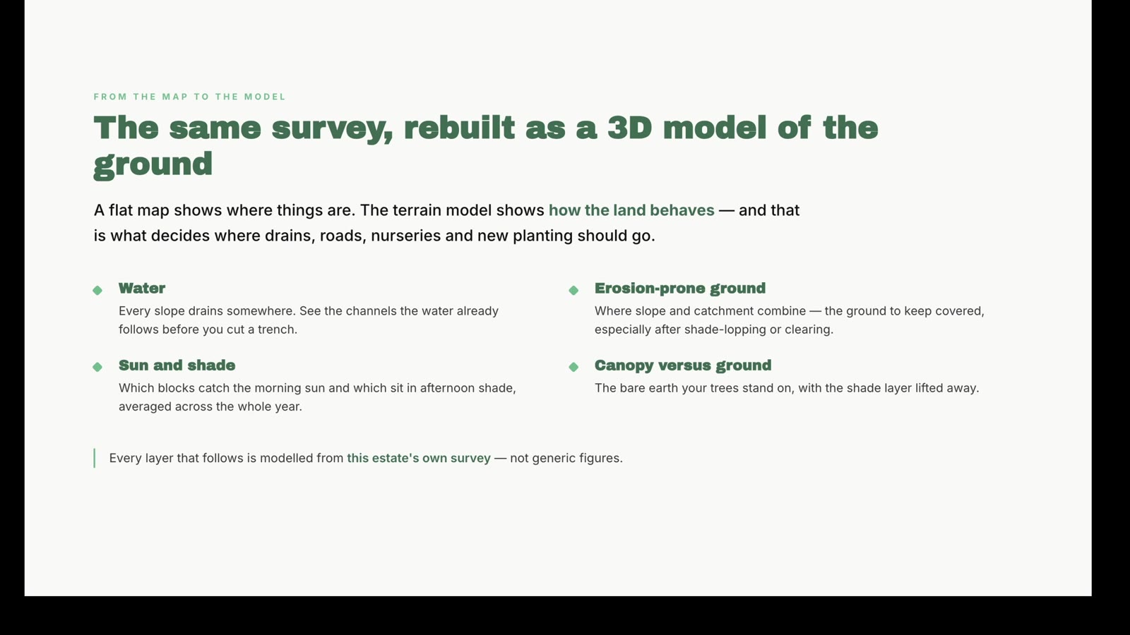
That distinction — where things are, versus how the ground actually behaves — is what decides where a drain, a road, a nursery bed, or a new planting block should go. So the survey gets rebuilt as a true 3D surface you can walk around:
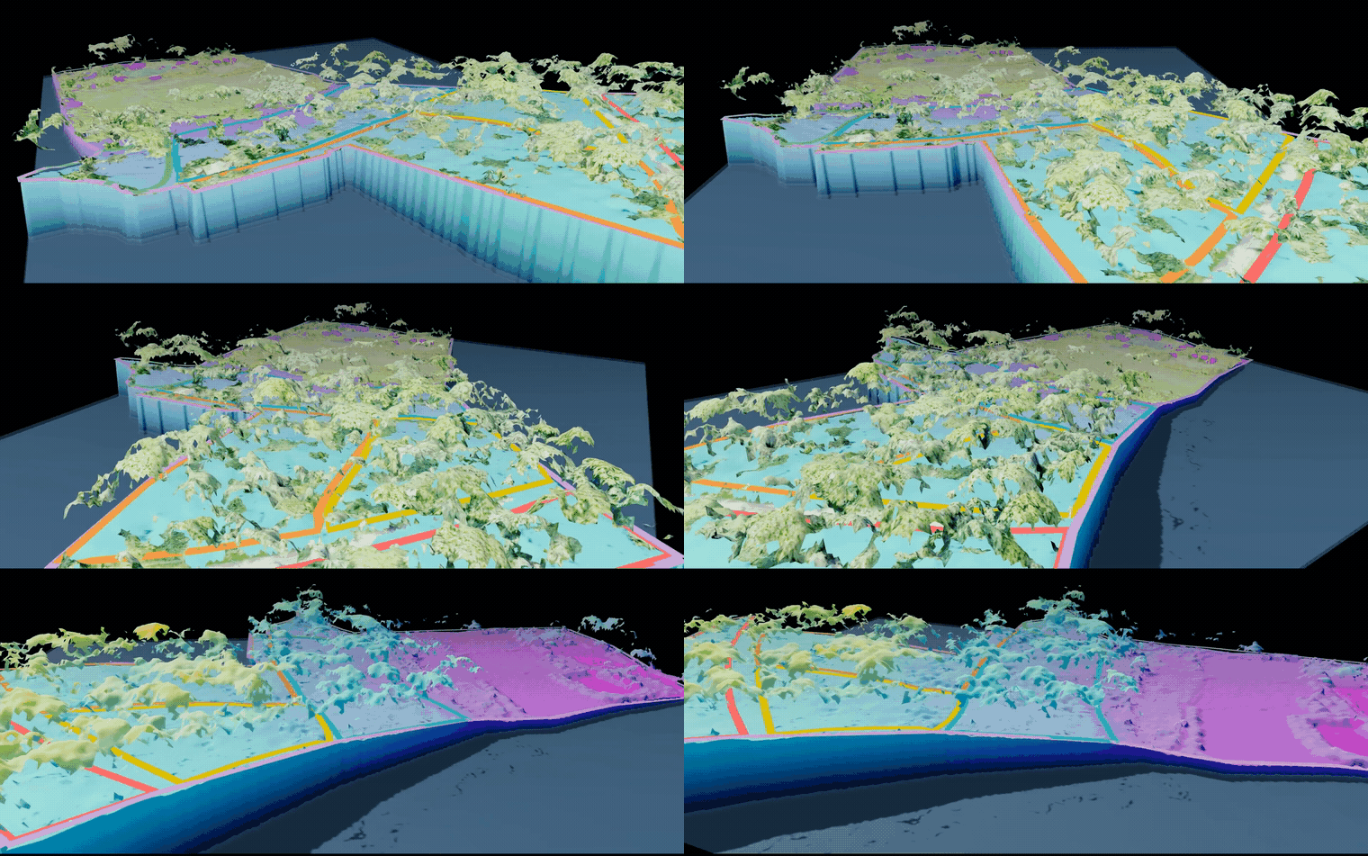
Every layer that follows — water flow, sun exposure, erosion risk — is modelled from this same estate’s own survey. Not a generic slope chart borrowed from somewhere else. We go deeper into how these layers are built in Reading the Land: Five GIS Layers Every Plantation Survey Should Include.
Water, erosion, and sunlight — measured, not eyeballed
Once the terrain exists in 3D, three questions that used to need a monsoon season to answer honestly get answered from one flight.
Where does water actually go? Trace the channels the land has already carved, before digging a single trench.
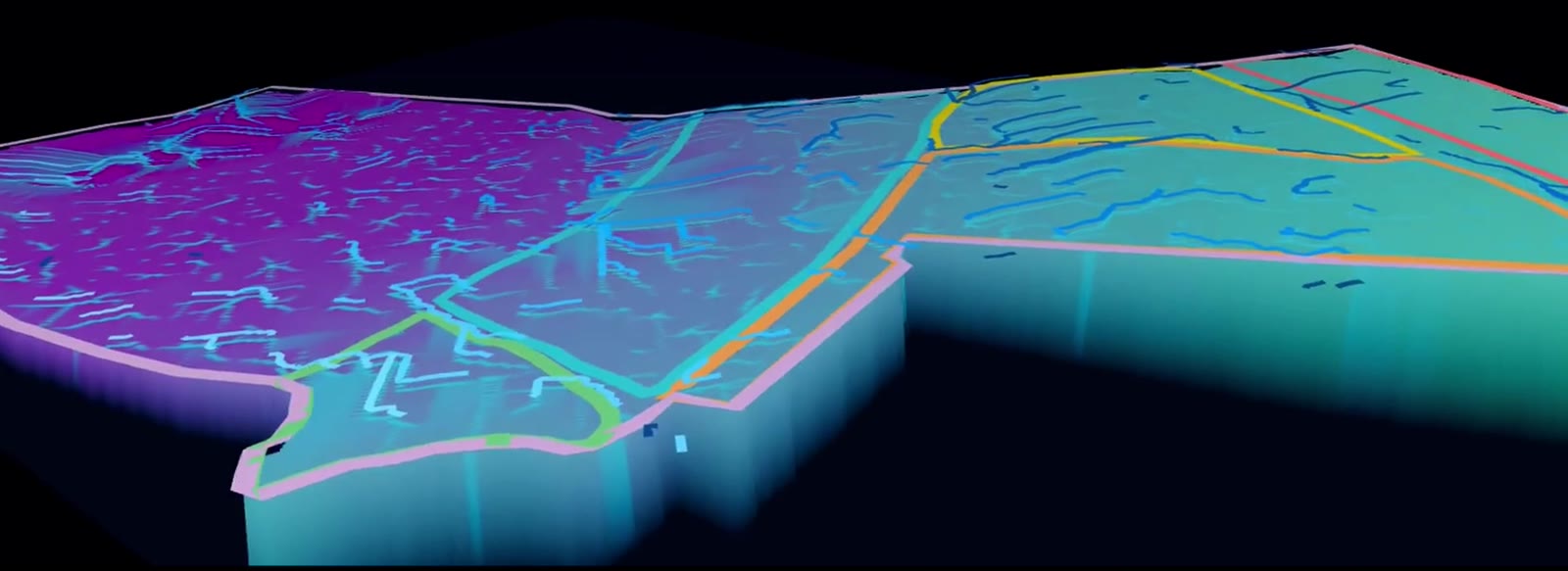
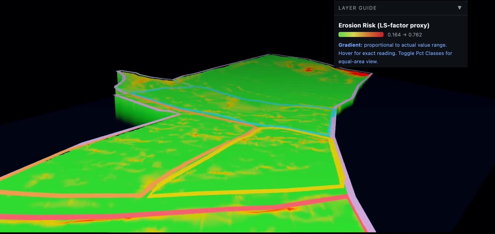
Where is the ground most exposed to erosion? Slope and catchment combine into a single risk score — the ground that needs cover crop or shade retention most, especially right after clearing or shade-lopping.
And which blocks catch morning sun versus afternoon shade, averaged across the whole year rather than the one day a drone happened to fly overhead?
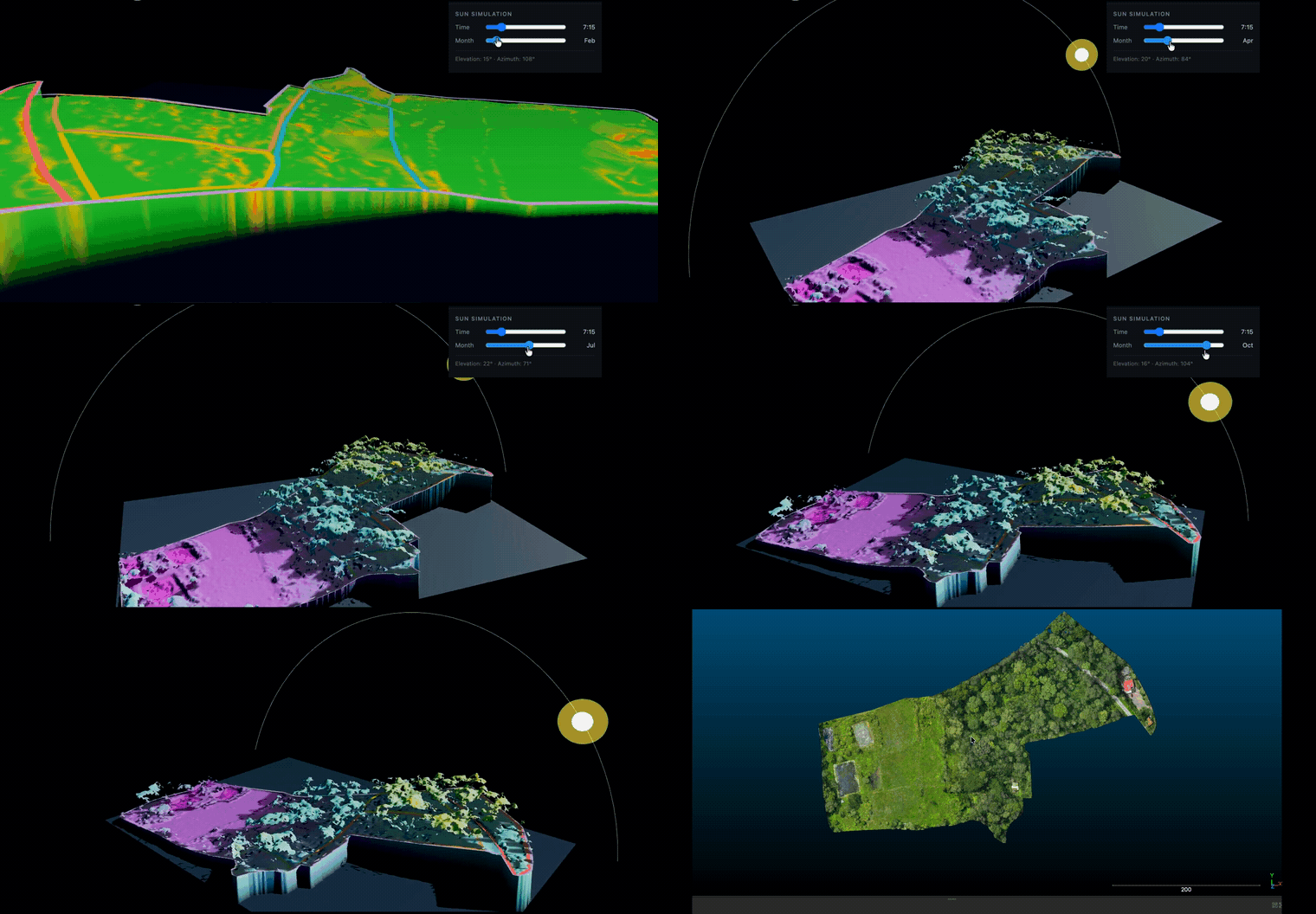
That last layer runs the sun’s position across roughly 348 points a year for every point on the canopy — real seasonal light, not a flat guess. It’s the same physics coffee’s shade-grown reality makes unavoidable to model properly, since sun exposure under a shade canopy is never uniform.
Every layer traces back to one real, dated record
None of this is synthetic. Each survey starts life as a record like this one — GPS accuracy, ground sampling distance, point cloud density, all logged the moment the flight lands:
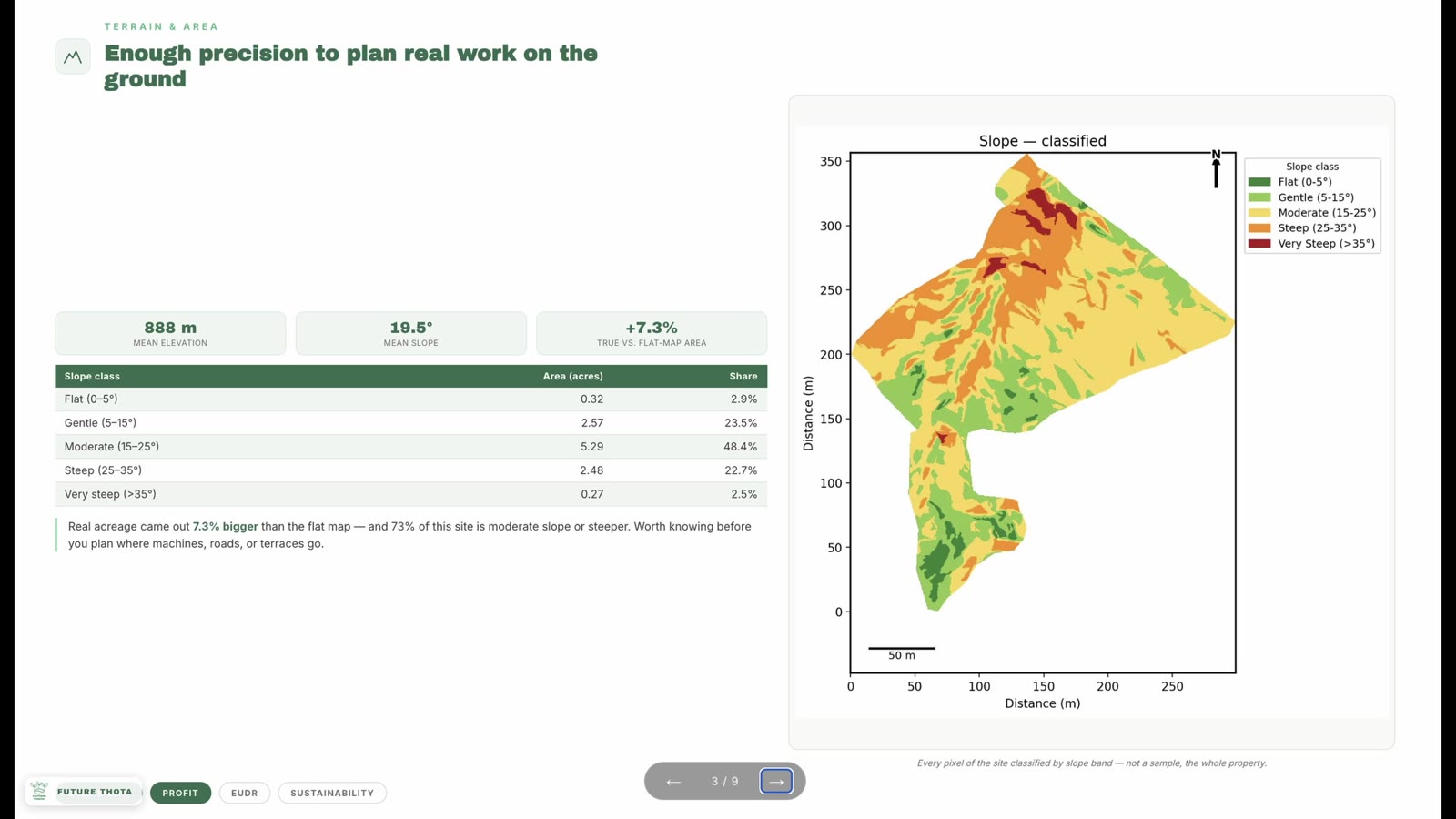
Centimetre-level accuracy here comes from RTK correction — the same setup covered in Hosting an RTK Base Station, for anyone curious what sits on the other end of that GPS signal. A quarter-million points, downsampled and dated, is what “ground truth” means in practice: a number you can re-measure next season and compare, not a claim you have to take on faith.
Canopy height, down to the metre
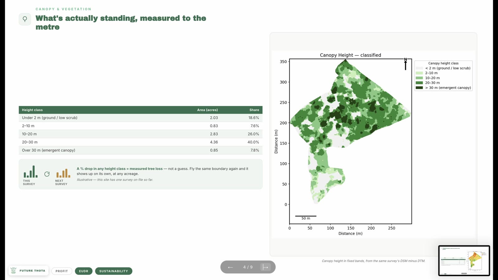
Height bands like these turn “the canopy looks healthy” into a number: what fraction of the estate sits under 2 metres, what fraction is emergent canopy over 30. Fly the same boundary again next season, and a drop in any height class shows up as measured tree loss — not a guess, not a memory of how things used to look. We walk through building this exact layer from a DSM and DTM in Generate a Canopy Height Model (CHM) from DSM and DTM in QGIS.
From measured light to a planting plan
Sun exposure and canopy data don’t stay abstract for long — they feed straight into where each crop should actually go:
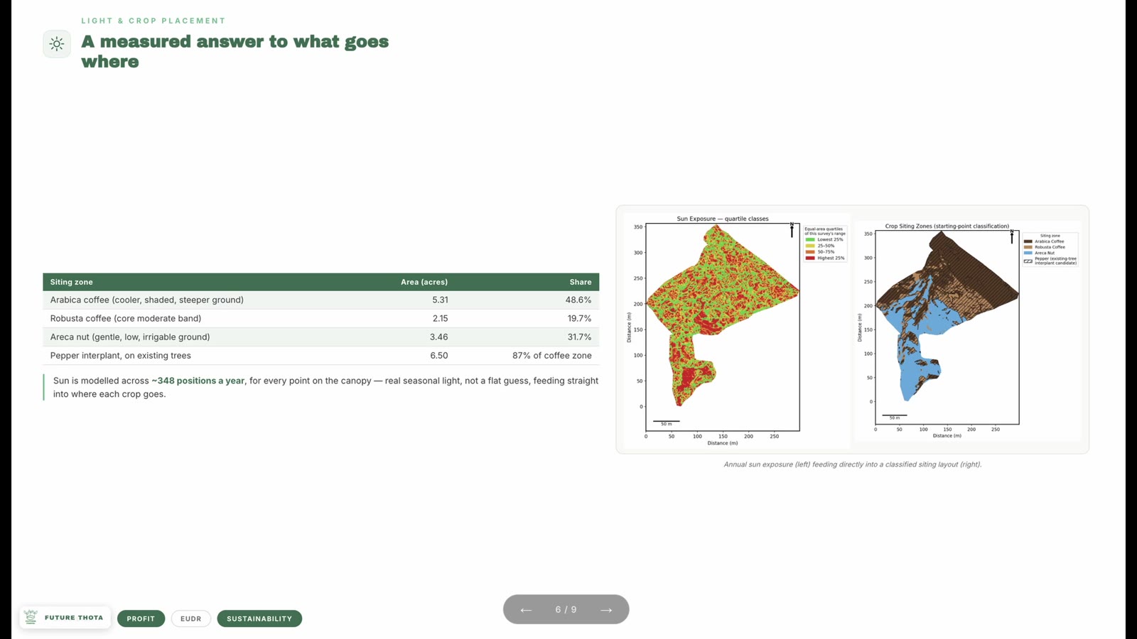
Cooler, shaded, steeper ground for Arabica. The moderate band for Robusta. Gentle, low, irrigable ground for areca nut. That’s not a rule of thumb applied after the fact — it’s a classification built directly from the same sun-exposure model above it. More on how this classification works in Precision Agronomy: Siting Crops and Counting Trees From the Air.
Shade-grown coffee is sustainable farming by design
Coffee doesn’t have to be grown this way. Most of the world’s coffee is sun-grown — canopy cleared, planted in dense monoculture rows, propped up by heavy chemical inputs because there’s no forest structure left to do that work for free. Shade-grown coffee farming is the opposite bet: keep the jungle canopy standing, and grow coffee as an understorey crop beneath it.
That’s not a stylistic preference — it’s a functioning agroforestry system. A multi-species canopy overhead means leaf litter, root systems, and multiple vertical layers of vegetation doing what cleared land can’t: holding soil, moderating temperature, and hosting the birds, insects, and small mammals a coffee monoculture has no room for. In growing regions like Kodagu and the wider Western Ghats — one of the world’s recognised biodiversity hotspots — a shade-grown coffee estate reads less like a farm and more like a forest that happens to produce a cash crop.
That standing canopy is also a carbon sink in its own right. Trees that would otherwise be cleared keep sequestering carbon above ground in their biomass and below ground in root systems and soil organic matter, year after year, for as long as the shade is retained. Multiply that across a working estate and the canopy isn’t incidental to production — it’s a small working forest: a carbon sink, a biodiversity refuge, and, in the most literal sense, a set of lungs for the land it sits on. This is what makes sustainable coffee farming a genuinely different proposition from sun-grown monoculture, not just a marketing distinction.
None of that is a reason to leave it unmeasured, though. The canopy height model and sun exposure layers earlier in this post exist precisely so that “we keep our shade canopy intact” stops being a claim and becomes a number — one measured at survey time, and directly comparable at the next one. That’s the same evidence a certification body, a sustainability-linked buyer programme, or a carbon credit scheme will eventually ask for anyway.
The operational layer: cost, activity, and CO2
A map is only half the value. The same boundary that carries terrain and canopy data also carries every operation performed on the land — labour, inputs, timing — tied to a location and a date, not a spreadsheet row disconnected from where the work actually happened. That gives full traceability of activity and cost across the estate, and enough structure to put a CO2 estimate against it. This is exactly what ThotaTracker is built to layer on top of the same map described above.
The same data pays for itself twice
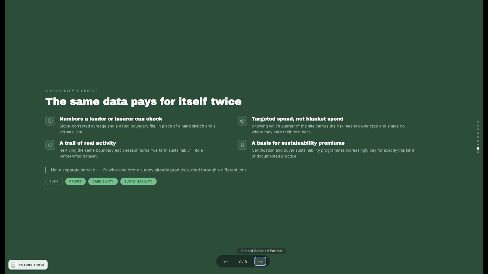
This is easy to miss until it’s laid out plainly: none of the above is a separate service billed on top of the survey. It’s the same flight, read through a different lens each time.
- A number a lender or insurer can check — slope-corrected acreage and a dated boundary file, in place of a hand sketch and a verbal claim
- Targeted spend, not blanket spend — knowing which quarter of the site carries the risk means cover crop and shade go where they actually earn their cost back
- A trail of real activity — re-flying the same boundary each season turns “we farm sustainably” into a before/after dataset
- A basis for sustainability premiums — certification and buyer sustainability programmes increasingly pay for exactly this kind of documented practice
See it in under a minute
If you’d rather see this end-to-end than read it, here’s the short version:
Talk to us about your own land
If you want to see what this looks like against your own estate’s boundary — coffee, tea, or anything in between — get in touch and we’ll walk you through a sample dataset, or scope a survey for your land. For the fuller picture, What You Get From a Real Drone Survey and our full services breakdown are good next stops.